If you've spent any time on Pinterest planning your wedding, you've probably noticed two very different looks dominating your feed. One is moody and saturated — deep blues, rich skin tones pushed warm, shadows that feel almost cinematic. The other is the opposite: bright, airy, washed out in the best way, whites blown out on purpose, everything soft and pastel. Both are beautiful. Neither one is what I do.
I shoot true to color.
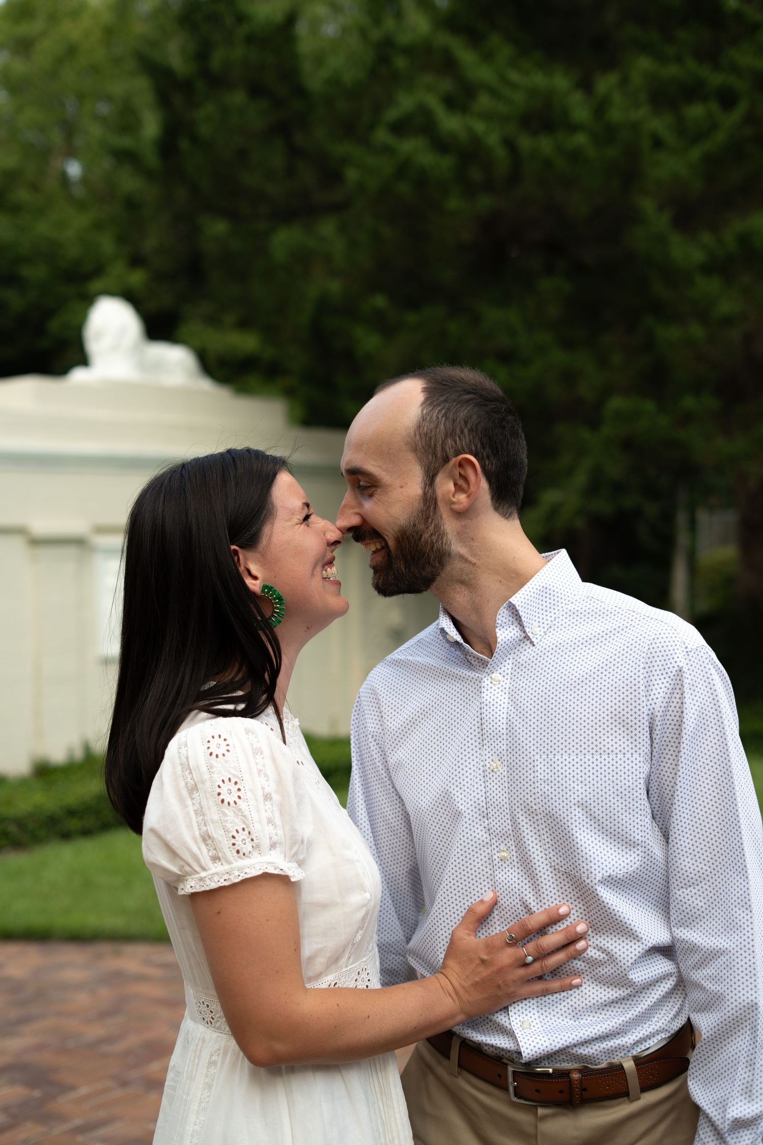
So what does that mean?
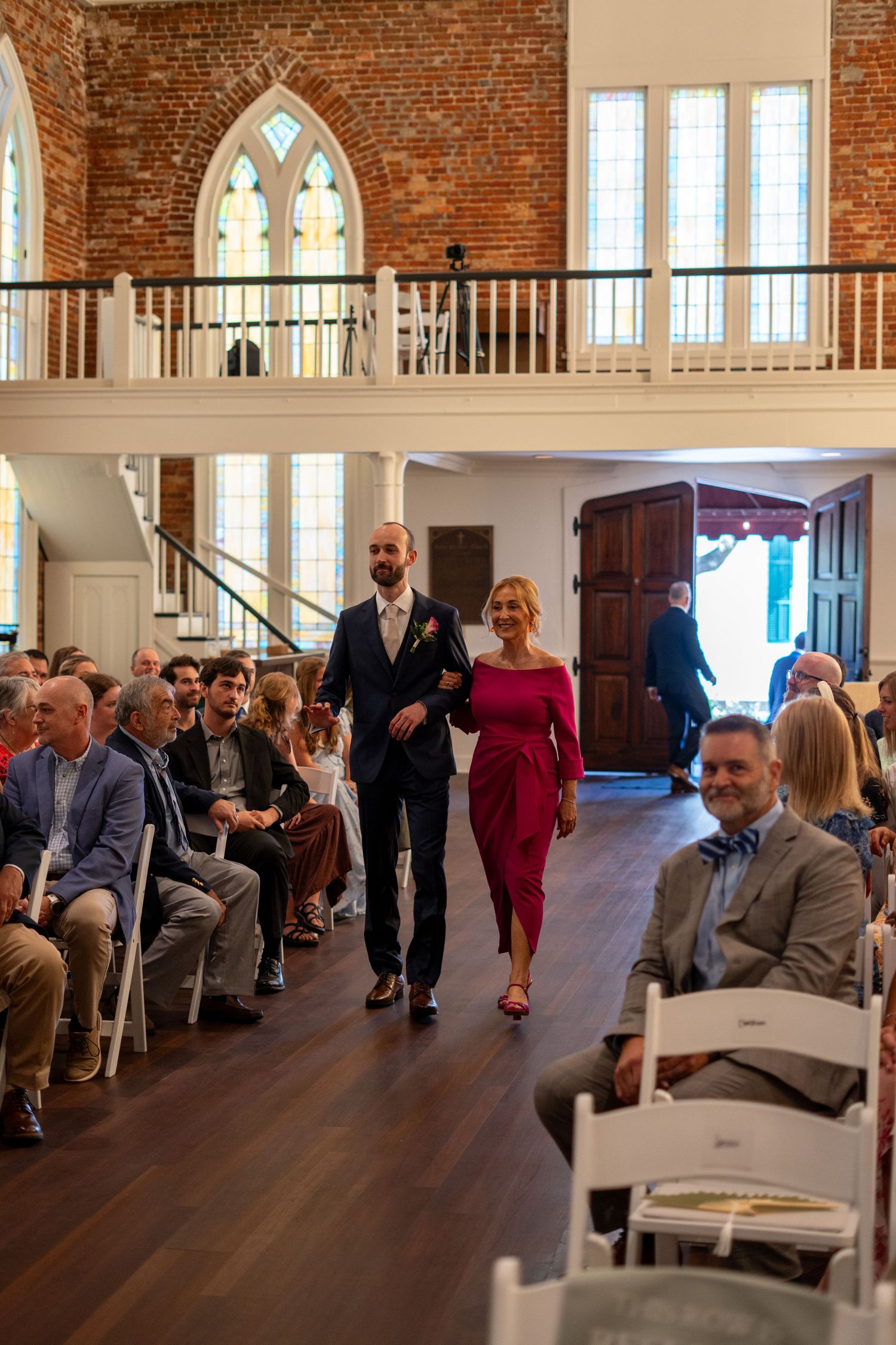
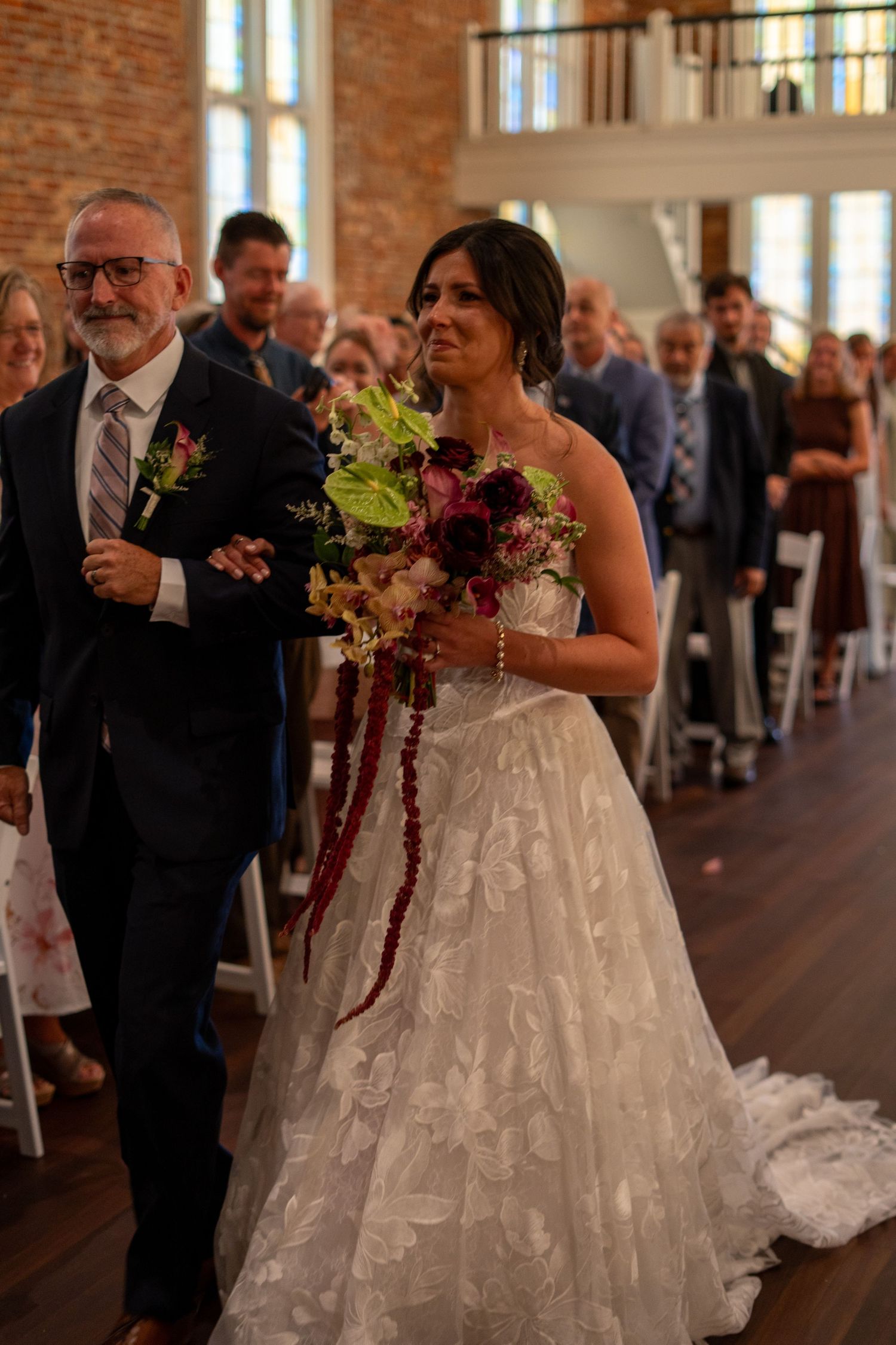
True to color photography means the final image looks like the day actually looked. Your ivory dress reads as ivory, not peach and not stark white. The greenery at your venue looks like the greenery that was actually there, not teal-shifted or golden-hour-filtered into something else. If your bridesmaids wore sage green, sage green is what shows up in the gallery.
It's not a lack of style — it's a different set of priorities. Instead of editing toward a trend, I'm editing toward accuracy. The goal is a photo that looks like a really, really good version of your day, not a photo that looks like a preset.
Why I lean this direction
Trends age. Truth doesn't. Super-saturated, high-contrast editing feels striking right now, and bright-airy has had its own long moment. Both are gorgeous — and both are recognizable as "of a certain era" when you look back at wedding photos even five or ten years later. A true-to-color photo doesn't carry that same expiration date, because it's not chasing a look. It's just showing you what was there.
You picked your colors for a reason. You didn't choose your florals, your dress, your bridesmaid dresses, your venue's brick or greenery by accident. A lot of couples spend months on those decisions. Pushing everything toward teal-and-orange or crushing the blacks, or blowing out the whites until every color goes pastel, quietly overrides a lot of that intention. I'd rather protect the choices you already made than replace them with mine.
Skin tones matter, especially across a full wedding party. Heavy stylization is often hardest on skin. Oversaturation can push skin orange or ruddy; the bright-airy look can wash skin out or flatten it. With a mixed wedding party — different skin tones standing next to each other in the same frame — true-to-color editing is what keeps everyone looking like themselves, not like they've been run through the same filter regardless of what actually suits them.
It photographs well now and later. True-to-color images tend to sit more comfortably next to your other photos — the ones from your childhood, from your parents' wedding, from ten years from now. They don't look like they belong to one specific style era. They just look like you, on your wedding day.
What this doesn't mean
True to color isn't the same as unedited or flat. I'm still shaping light, still adjusting exposure and contrast, still making choices about mood — golden hour still looks golden, a dim reception still feels moody and warm. The difference is that I'm using editing to support what was actually there, not to overwrite it. Think "the best possible version of the real thing," not "no editing at all."
It also doesn't mean every photo looks identical. Indoor light, outdoor light, overcast skies, string lights at your reception — they all bring their own color and mood naturally, and I let them. True to color means honoring that variation, rather than flattening every image into the same saturated or pastel filter regardless of what the light was actually doing.
The bottom line
Trends in wedding photography come and go — I've watched a few cycle through already. What doesn't go out of style is a photo that looks like your wedding, in your colors, with your people looking like themselves. That's what I'm after every time I press the shutter.